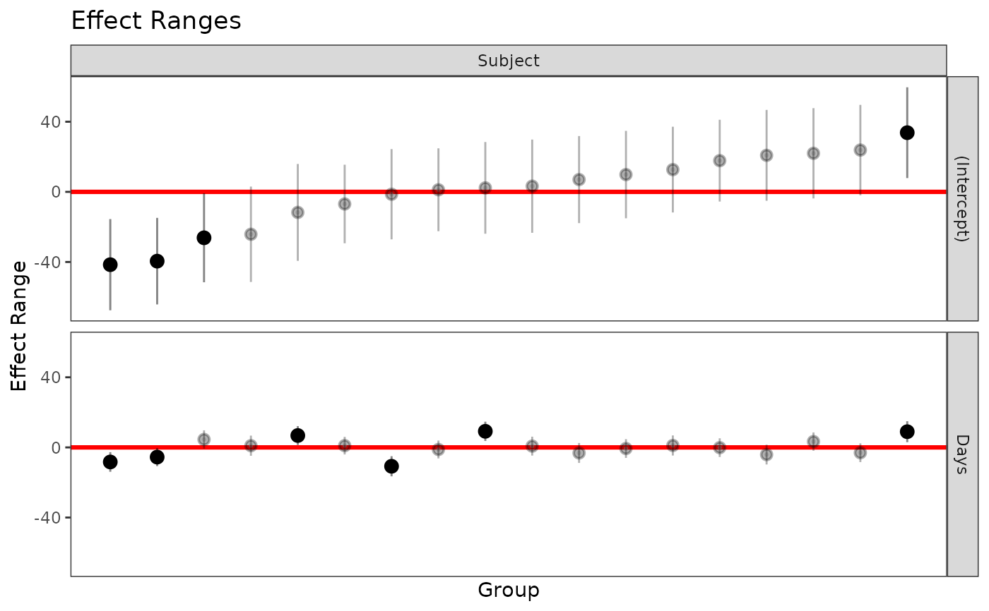
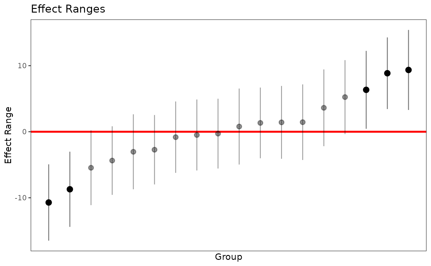
Plot the simulated random effects on a ggplot2 chart. Points that
are distinguishable from zero (i.e. the confidence band based on level
does not cross the red line) are highlighted. Currently, the plots are ordered
according to the grouping factor.
Usage
plotREsim(
  data,
  level = 0.95,
  stat = "median",
  sd = TRUE,
  sigmaScale = NULL,
  oddsRatio = FALSE,
  labs = FALSE,
  facet = TRUE
)
Arguments
- data
a data.frame generated by
REsimwith simulations of the random effects of amerMod- level
the width of the confidence interval
- stat
a character value indicating the variable name in data of the midpoint of the estimated interval, e.g. "mean" or "median"
- sd
a logical indicating whether or not to plot error bars around the estimates (default is TRUE). Calculates the width of the error bars based on
leveland the variable named "sd" indata- sigmaScale
a numeric value to divide the estimate and the standard deviation by in the case of doing an effect size calculation
- oddsRatio
logical, should the parameters be converted to odds ratios before plotting
- labs
logical, include the labels of the groups on the x-axis
- facet
Accepts either logical (
TRUE) orlistto specify which random effects to plot. IfTRUE, facets by bothgroupFctrandterm. Iflistselects the panel specified by the named elements of the list